

Healthy Food America Branding & Illustration
Completed: 2017
Team: Pyramid Communications
Healthy Food America (HFA) is a brand new organization driving change in food policy and industry practice. They came to Pyramid Communications and requested a name, brand, and logo.
Unlike most of the other healthy food organizations in the market, HFA focuses on preventing the effects of unhealthy food, and does so with a fairly aggressive stance. Creating a visual brand that focused on the negative but was still visually playful and credible was a fun challenge; you'll see that I combined angles, unsettling close-ups, and toxic colors with plenty of white space and playful illustrations.
HFA's logo, a combination image of a plate and a target, is the right balance of clever and aggressive. I worked with the concept in many forms before settling on this one, which also uses the angles present in the rest of the visual brand.


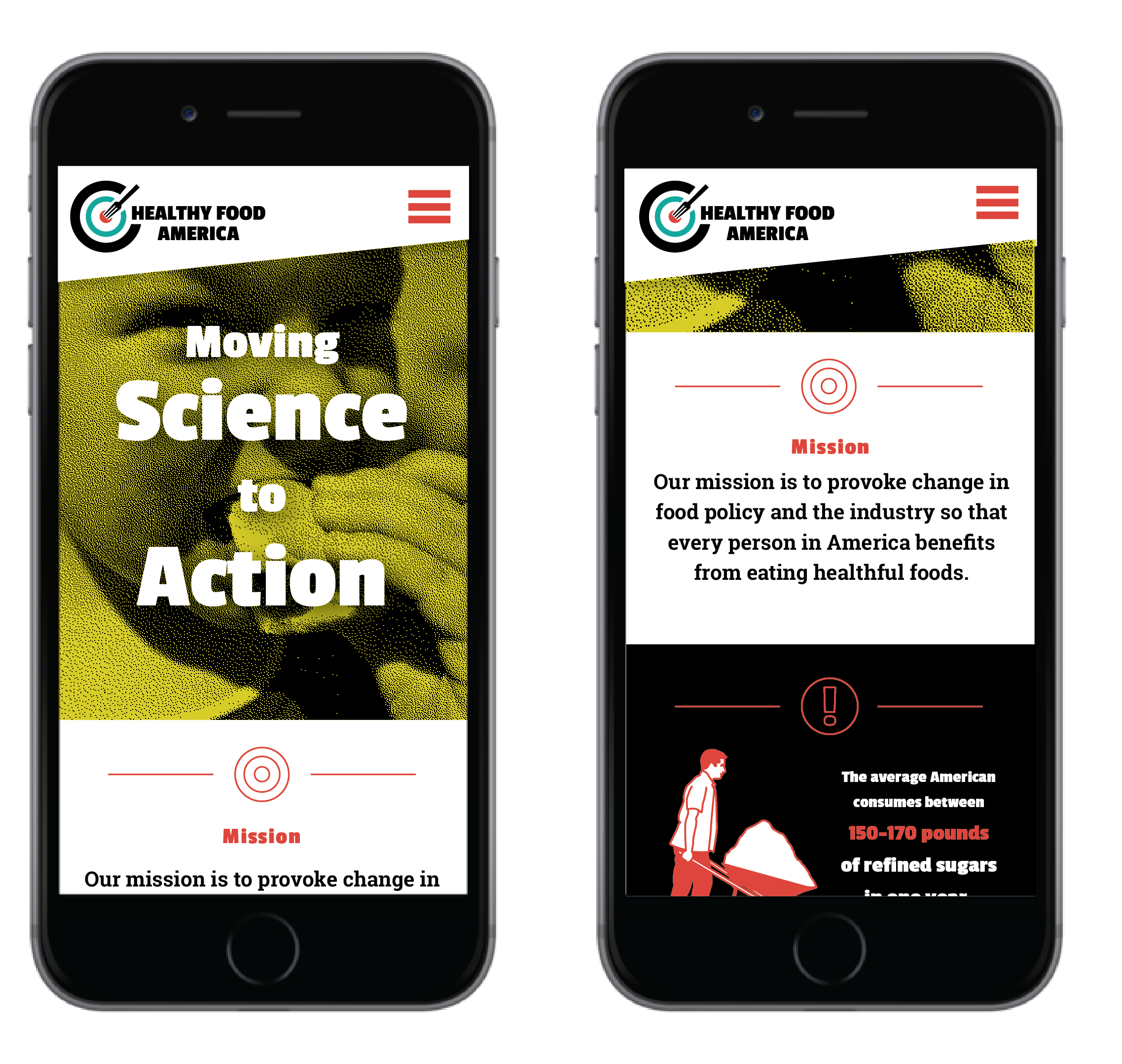
After our initial work with HFA to define visual brand and logo, they returned to work with Pyramid on a few extra illustrations to highlight the organization's work in combatting sugar. I worked closely with my creative director to conceptualize these illustrations. Then, when I started illustrating, I found that a couple of small breaks from the brand we'd created earlier in the year were necessary. For example, to show the diversity of people that HFA intends to reach, we needed to introduce skin colors outside of the brand color palette.


